Dalai Felinto shares the design process for the new Geometry Nodes icon.
The Geometry Nodes project finally has its own icon: 
The Previous Icon
It is not that Geometry Nodes had no icons. But it had no unique icon. Until now it was using the generic “Nodes” icon from Blender: 
That icon wasn’t widely used so we rolled with it and focused our energy elsewhere (namely making Geometry Nodes worthy of an icon of its own).
However this was the icon used already for the compositor and shader nodes Node Groups. And since the Asset Browser started to support node groups, this problem became more evident:
Nodes + Geometry
Which icon can describe a system that can create the unthinkable? The system supports meshes, but also curves, volumes, point cloud. It will be the base for the procedural part of the hair project.
We asked the community for help, and Andrzej Ambroz contributed an initial take on it:
Andrzej is the mastermind behind the Blender icons, and his style and craftsmanship shows. Those icons fit right in place with the rest of the icons. However …
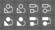
When you look at the other node editor icons, you can see that none of them depicts nodes. Here you can see them respectively:

They try to convey what is accomplished with the nodes, not the nodes themselves. We may have in the future Collection Nodes. How would they be visualized then? If you go in that direction we start to have icons that look too much alike and that quickly failed to work when reduced (icons here at 200%):

Same icons at 100%:

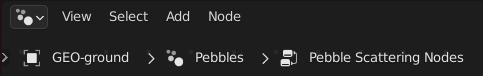
Pebbles
What if we could put this all aside and boldly seek something that resonates more closely with the project? Geometry Nodes was named as such after it pivoted from dynamic particles to point scattering.
The initial use case was about being able to easily distribute points in a scene and instance pebbles on them. To this day this is the initial step often seen in complex node setups, and an essential step for the upcoming hair project.
Inspired by that I stretched my rusty design muscles, sketched some points in a white board, and came up with this:  . A bit too noisy, but simple and daring. I sent them over to Pablo (Vazquez) who sent them back with a few variations, removing some of the pebbles or moving them around:

A Detour
Falling in love with your first idea is one of the most dangerous traps in a creative process. No one is immune to this, and we have set to explore other ideas, some abstract, some more literal. Here are a few:
- The flower with infinite petals series:

- The bridge series:

The Final Icon
After all considered, we went back to the pebbles/points concept. It is simple, graphically pleasant, and it grew on us. Pablo and I worked on a final pass to get the icon to take a bit more of the available vertical space and there we have it:

Bonus
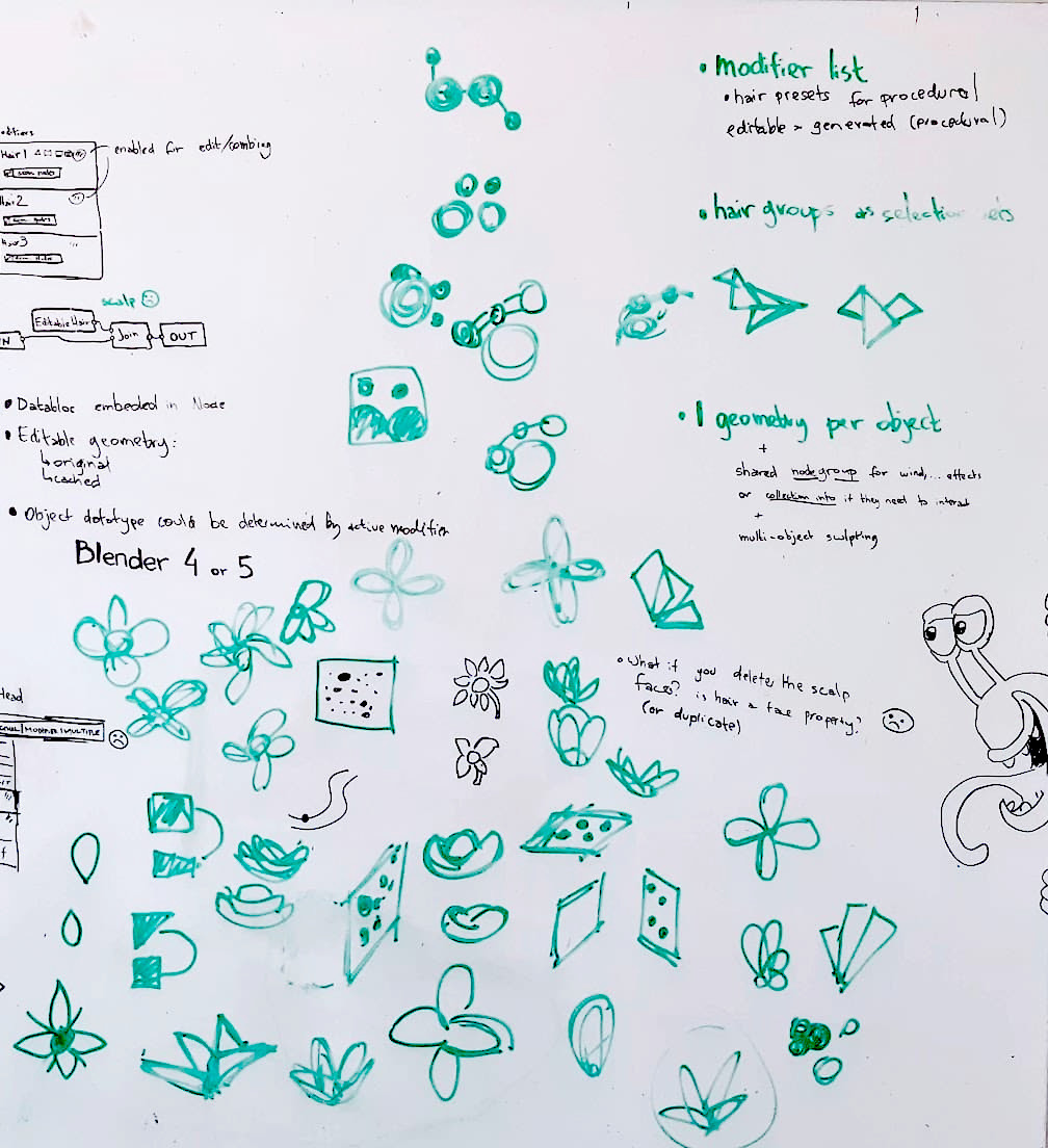
The whiteboard with the original draft (dark points surrounded by a green border), and many doodles also by Pablo and Francesco Siddi.
Thanks to the community for the ideas and exploration. This was a fun experience to come up with a concept that the team feels connected to and that fits with the rest of Blender.
Let us know what you think about sharing this type of behind-the-scenes development process.
Dalai
. . . The icon for the particle node is born
Love the final result!
Great work – love it!
jendrzych
Lovely, readable. More reasons to hit that icon yet more often!
I love it!
The final version is not quite correct, although it has something in common with dots, but as for me it resembles some particles, please consider other icon options, for example, a solid rectangle with a circle more reflects the essence of the nodes (in a visual sense)
The icon design concept itself is objective, but as a node system, it does not necessarily have to be graphically updated. On the other hand, as described above, this can lead to confusion, but what prevents giving names to this in order to determine which node system is used, besides the name is automatic. Of course, graphically it probably improves perception more than navigating by name, in general, I don’t really see any sense in this from the technical side, but from the philosophical side I’ll leave it to the experts)
Here’s something you probably didn’t think about. What is the purpose of geometry nodes? To make your own modifiers.
What is the icon for modifiers? A wrench.
So… What should the icon be for nodes to create your own modifiers? Nodes+Wrench. That makes sense, right? Or.. why not just the same wrench?
The icon looks good. I’m just wondering why it’s only been added to the 3.3 alpha and not the 3.2 beta. I would have assumed changing the icon would be small enough that it wouldn’t be a problem.
I’m not a developer, of course, so please correct me if my assumption is mistaken.
There is a “No User Interface changes after Beta” policy. Also in 3.3 is when we plan to start having initial support for hair, which is when it was more important to have a new icon.
I don’t see a link between pebbles/scattering and an editor designed to be as flexible as possible to generate geometry.
This is a non-objective, very sentimental choice,
that do not represents the goal of the product
You can look at the icon as a constellation of stars… a picture of the cosmos, a symbol for a world of possibilities. I think the icon is good.
I’m wondering if some important nodes can also be designed with a ui ah? It is convenient for people with different languages to know what it is at a glance
Initially I thought that icons were added to each node. Like other software
Great that they have reached a result with the community.
Personally I imagined that in the geometry nodes icon, and above all with the new field system, they were going to use the diamond shapes of the sockets, which is the most visually characteristic of that section. Even the diamond shape is used in the 3D view to display points. But it’s just a point of view and I’m glad that geonodes now have their own recognizable icon.
Congratulations
We considered this. But technically the fields should/could be present in other node systems. In fact the entire shader nodes are mainly fields. We just thought better not to force this concept down to the other node systems (yet?).
Not bad ! I would try to connect those points somehow to convey the “geometry” part better, still. Points on a surface…
Right now, to be frank it looks a bit generic and one could interpret those points as particles, or rigid bodies. I think it needs an additional pass.
I agree, it reminds me more of particles than geometry.
Geometric nodes and particle nodes are both point information and should not be separated
Totally respect the process and acknowledge the share! ❤❤🙏👍
In order to prevent spam, comments are closed 15 days after the post is published. Feel free to continue the conversation on the forums.